Cozinha das Flores by Nuno Mendes
Art Direction, Photography
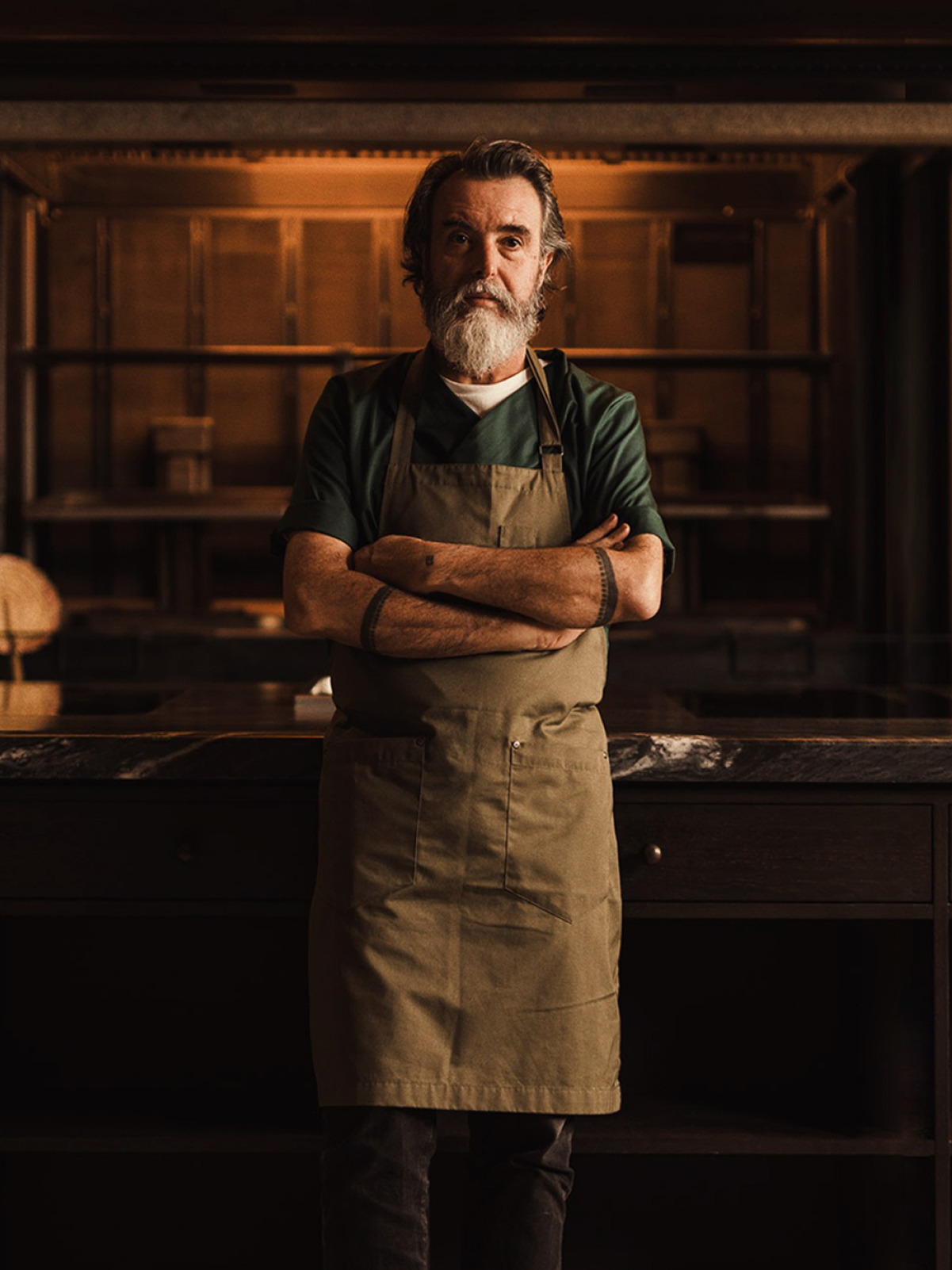
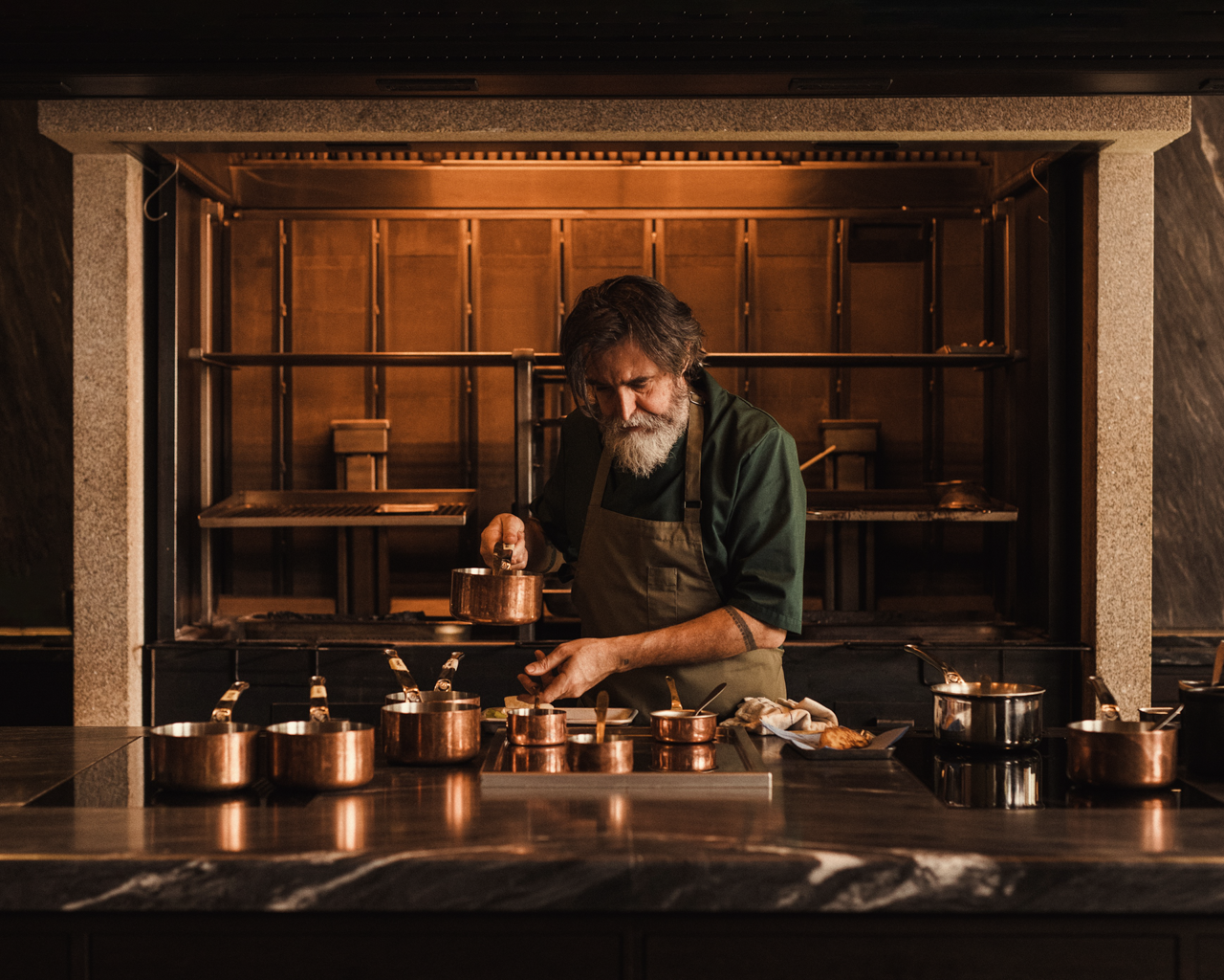
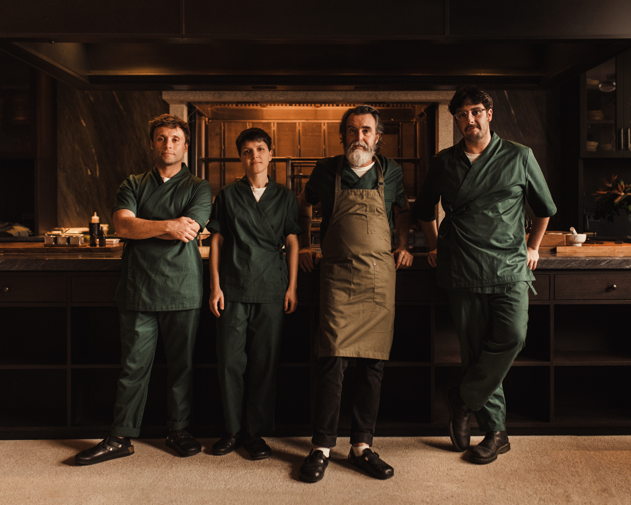
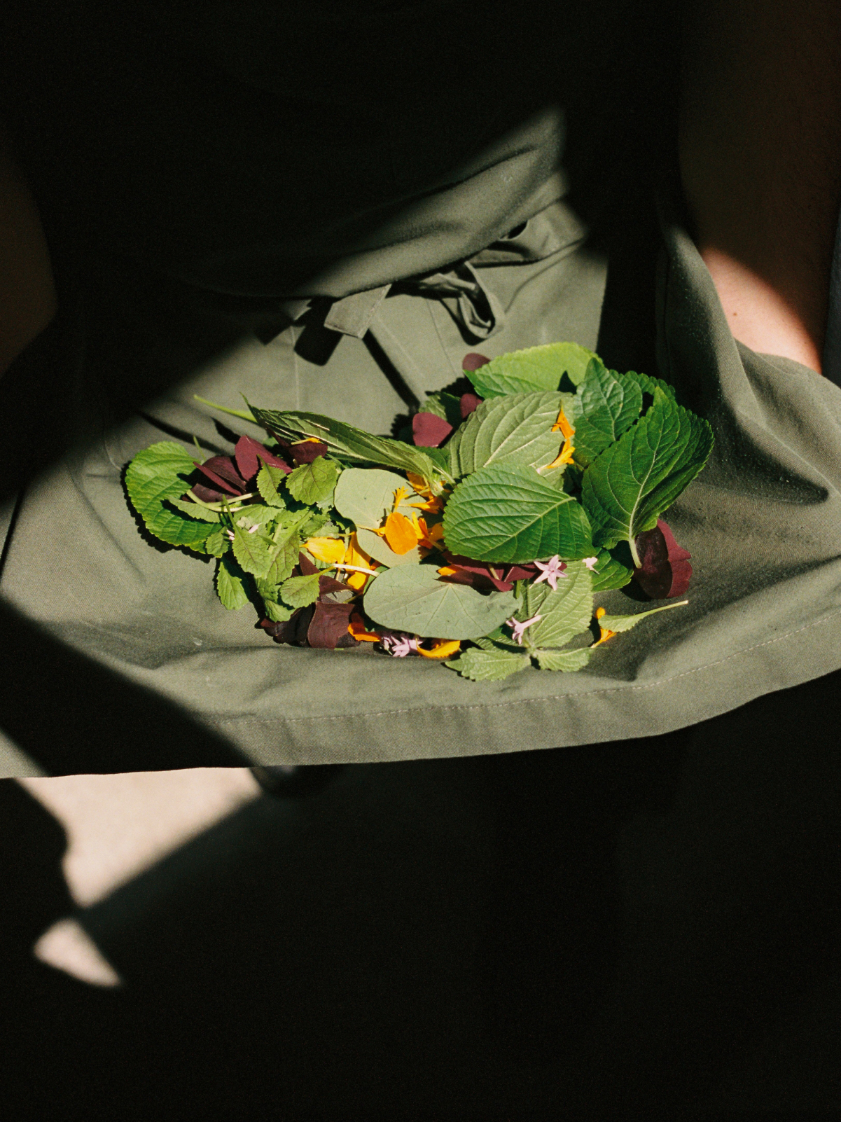
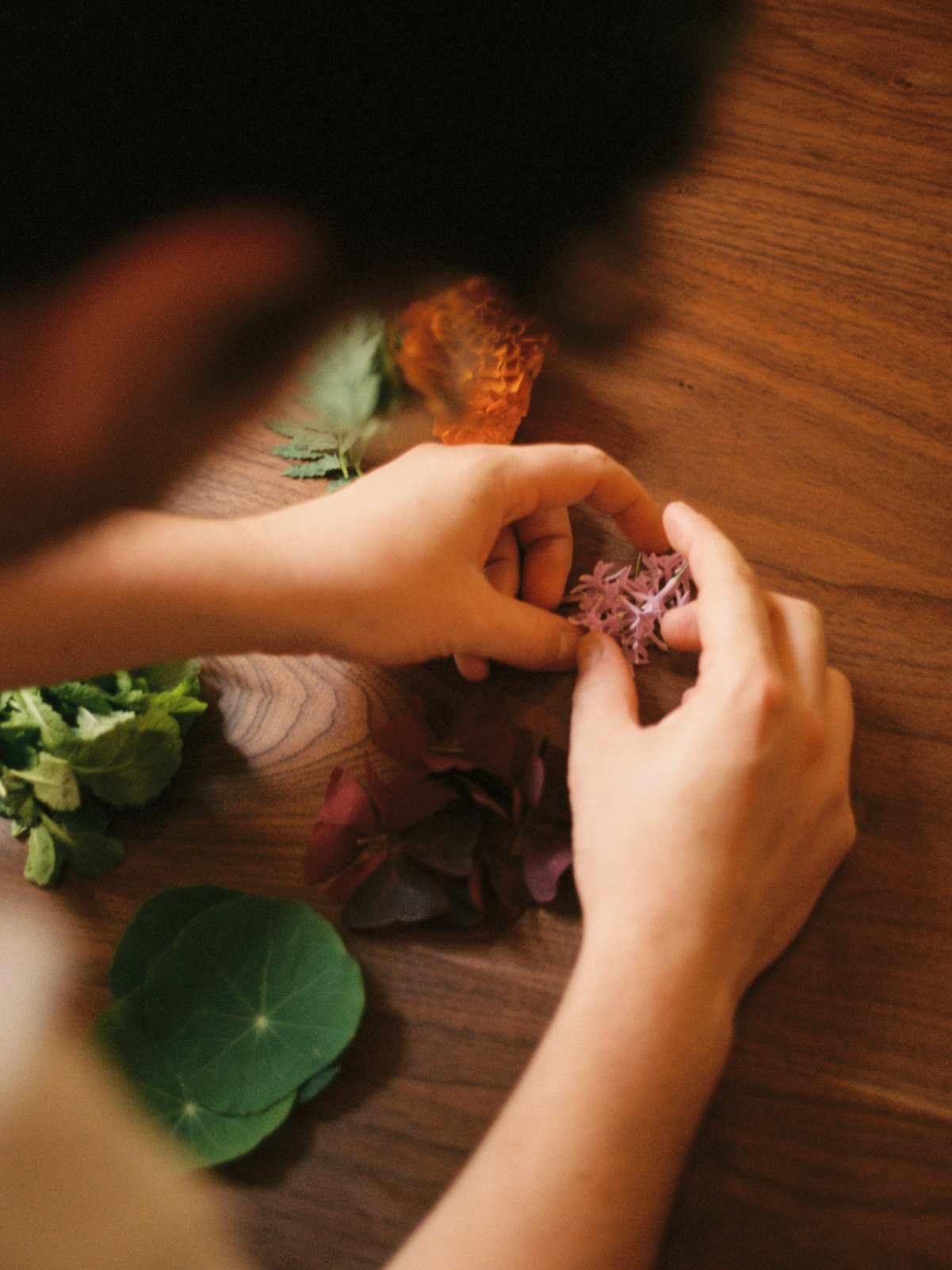
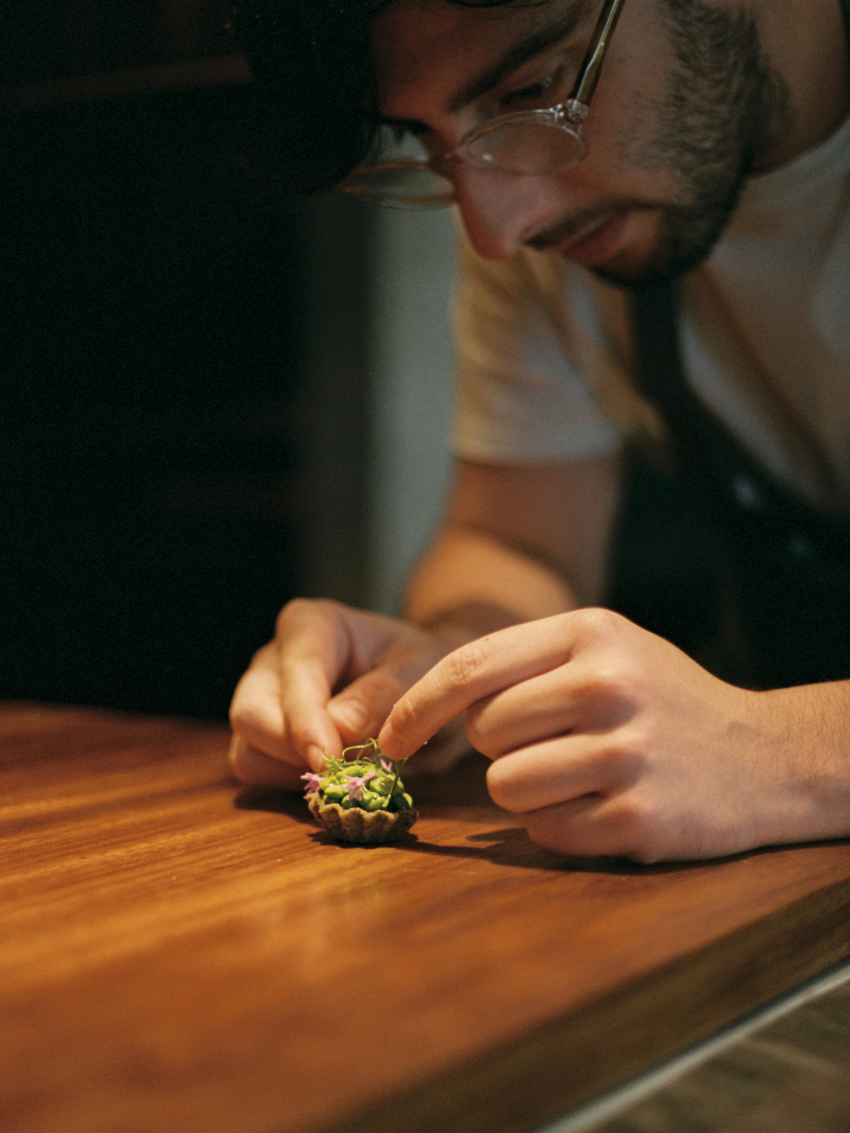
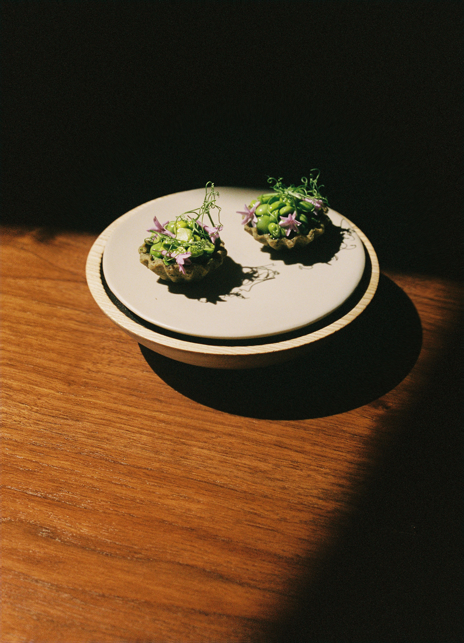
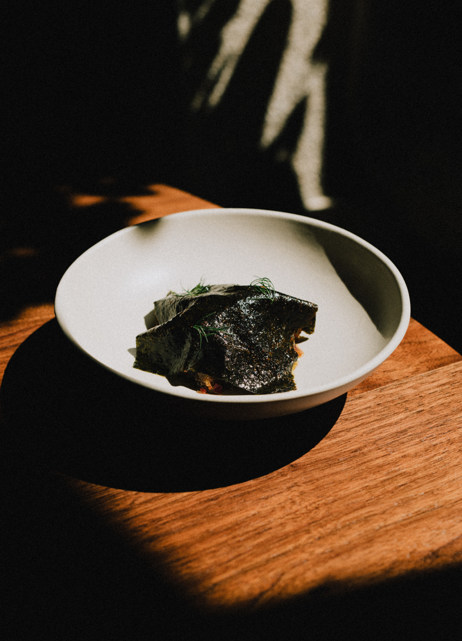
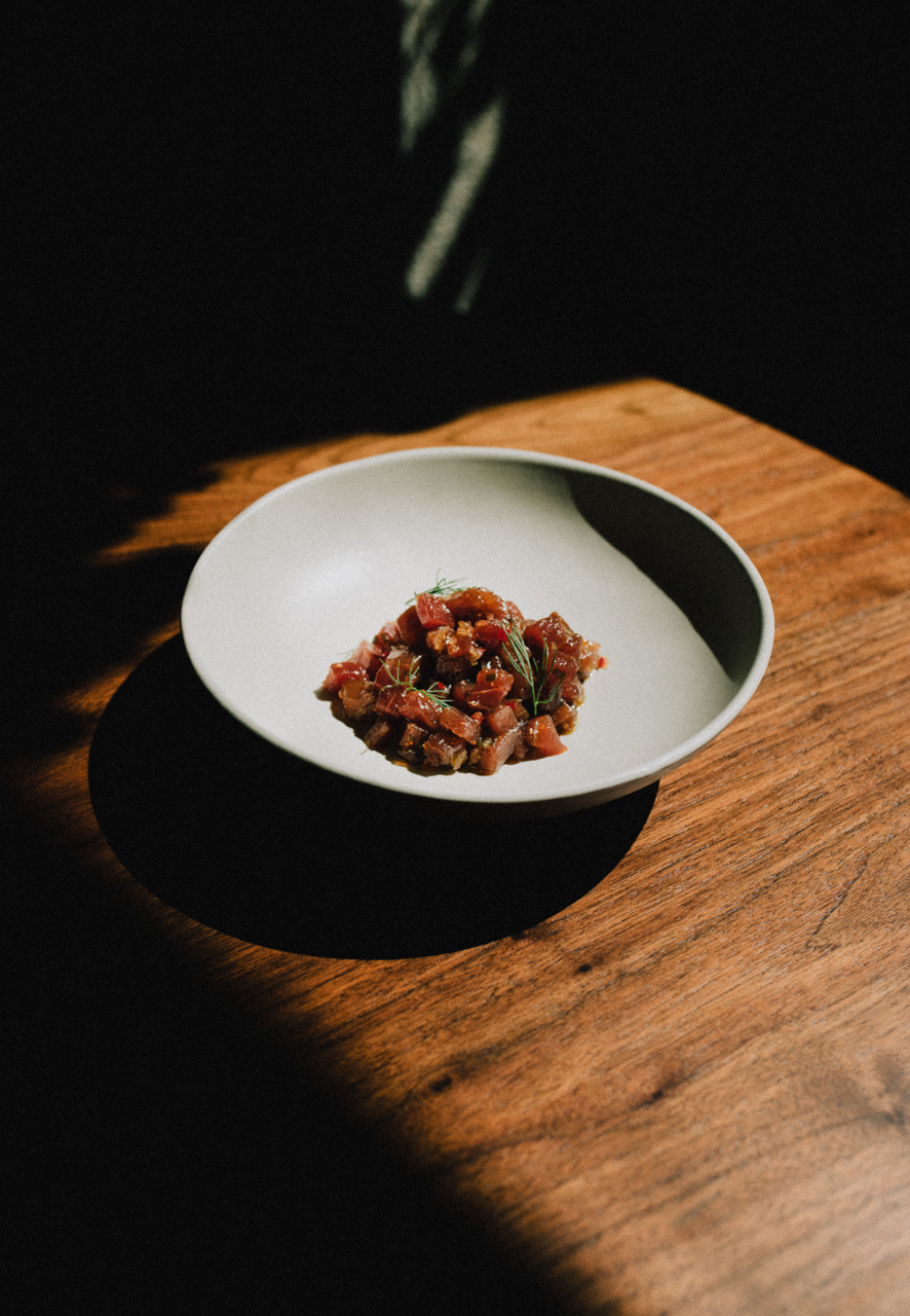
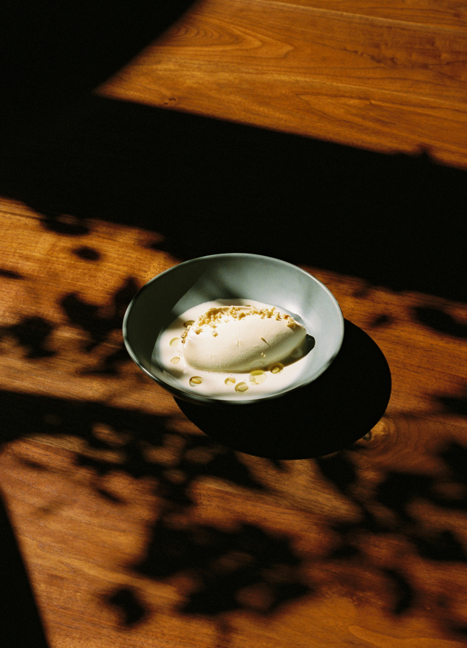
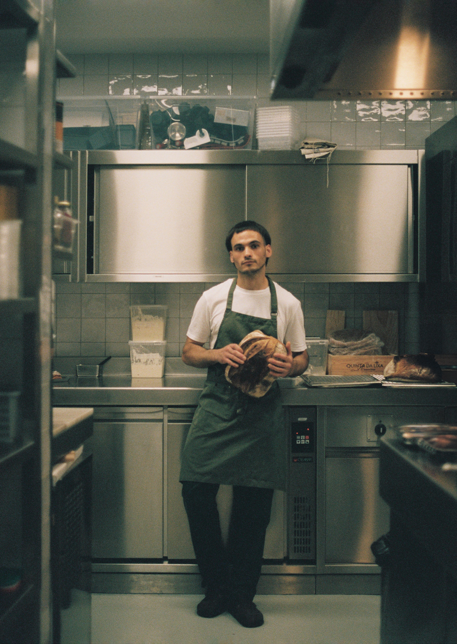
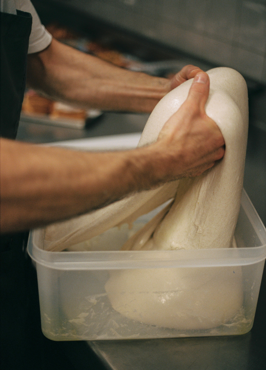
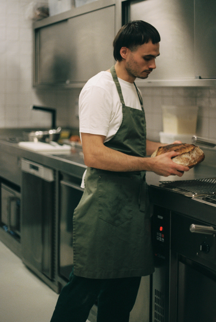
Press campaign for Michelin star chef Nuno Mendes’ newly opened restaurant, Cozinha das Flores. The art direction aimed to communicate how the warmth and conviviality of Porto would be woven throughout the guest experience.
Imagery was featured in The New York Times, Monocle, Wallpaper Magazine, Monocle, Dezeen, Vogue Singapore, Conde Nast Traveller, Urban Junkies.
Photography by Luís Moreira & Kresten Julian Sommer
Brand Identity by All the Way to Paris
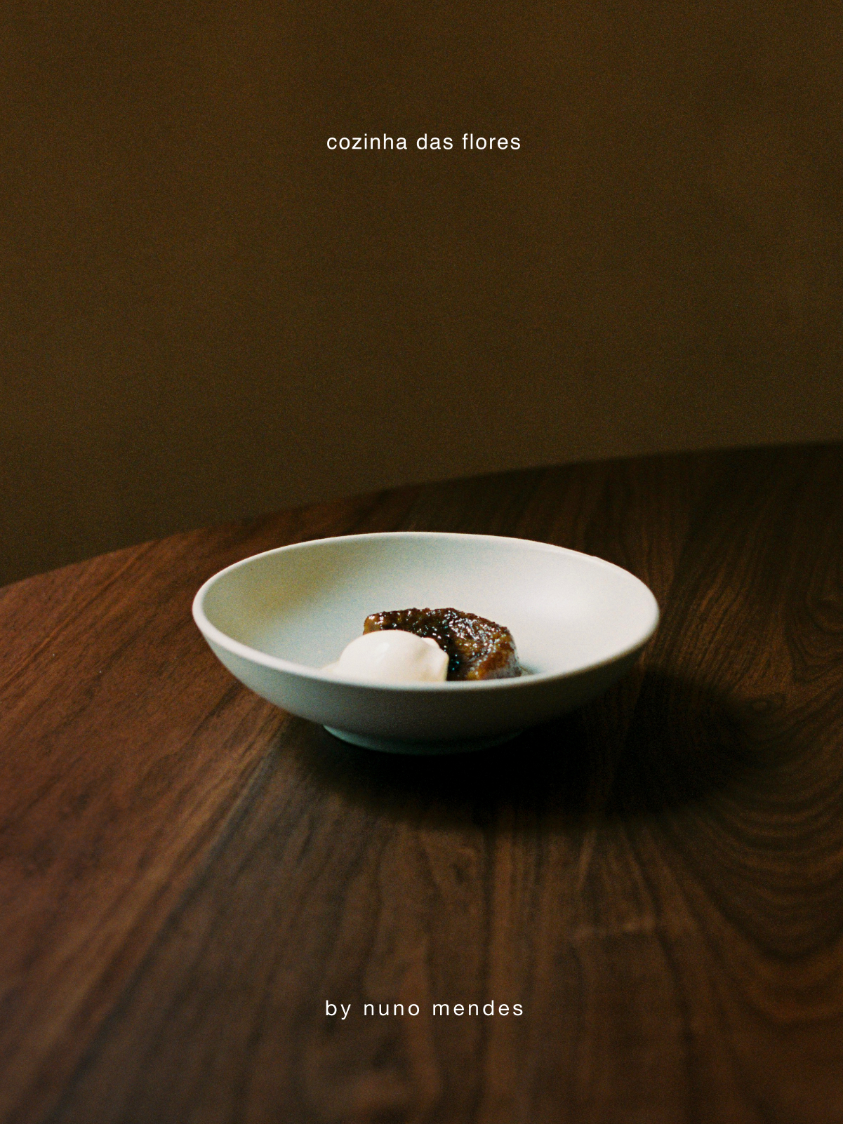
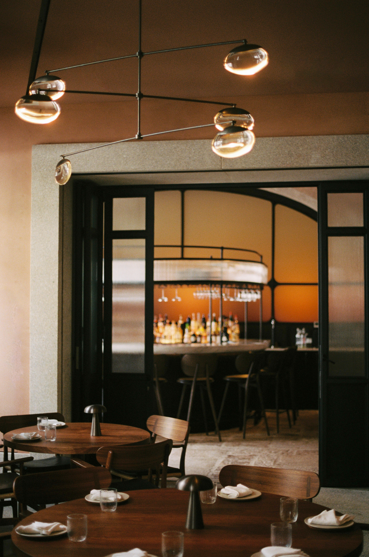
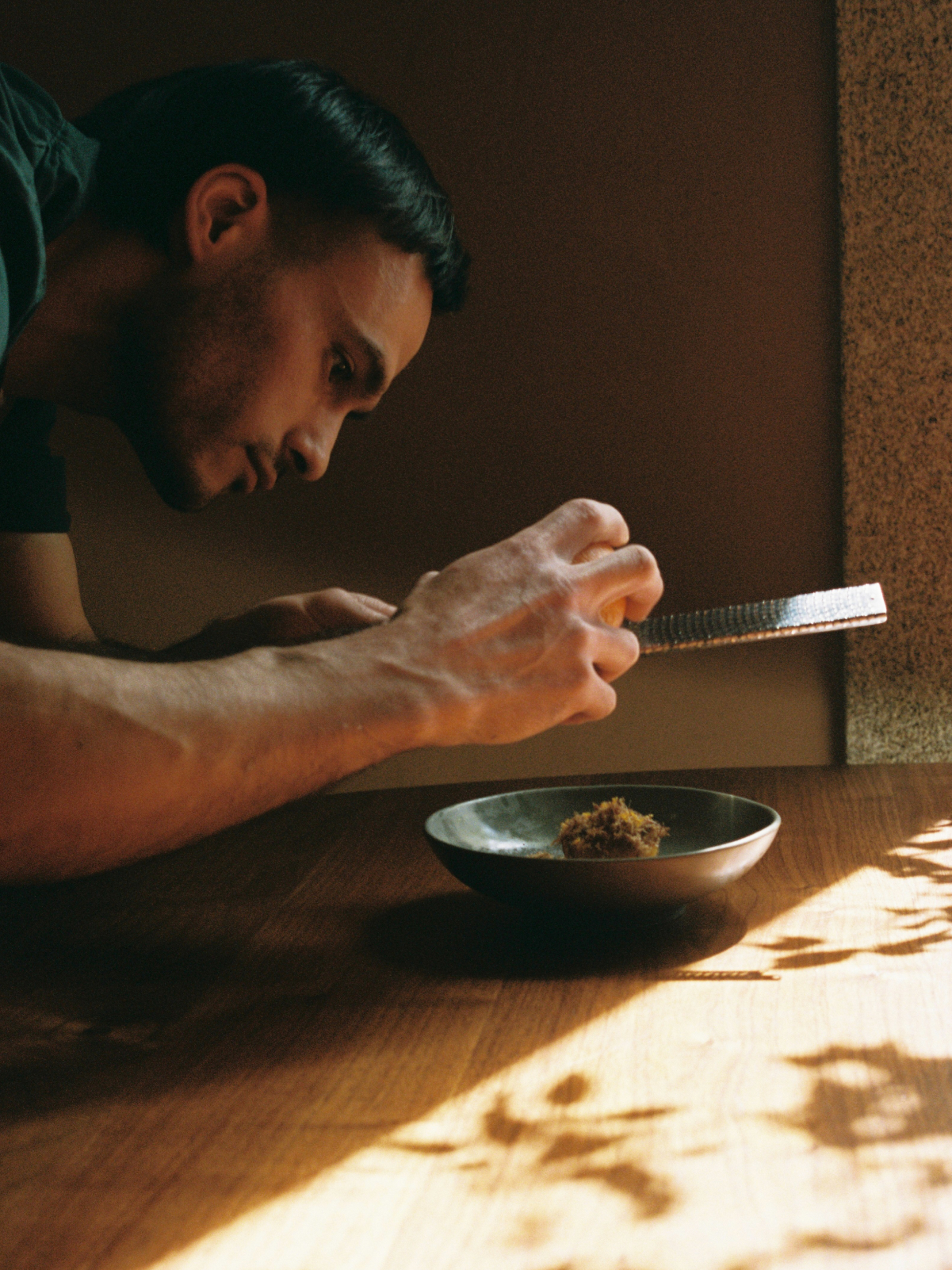
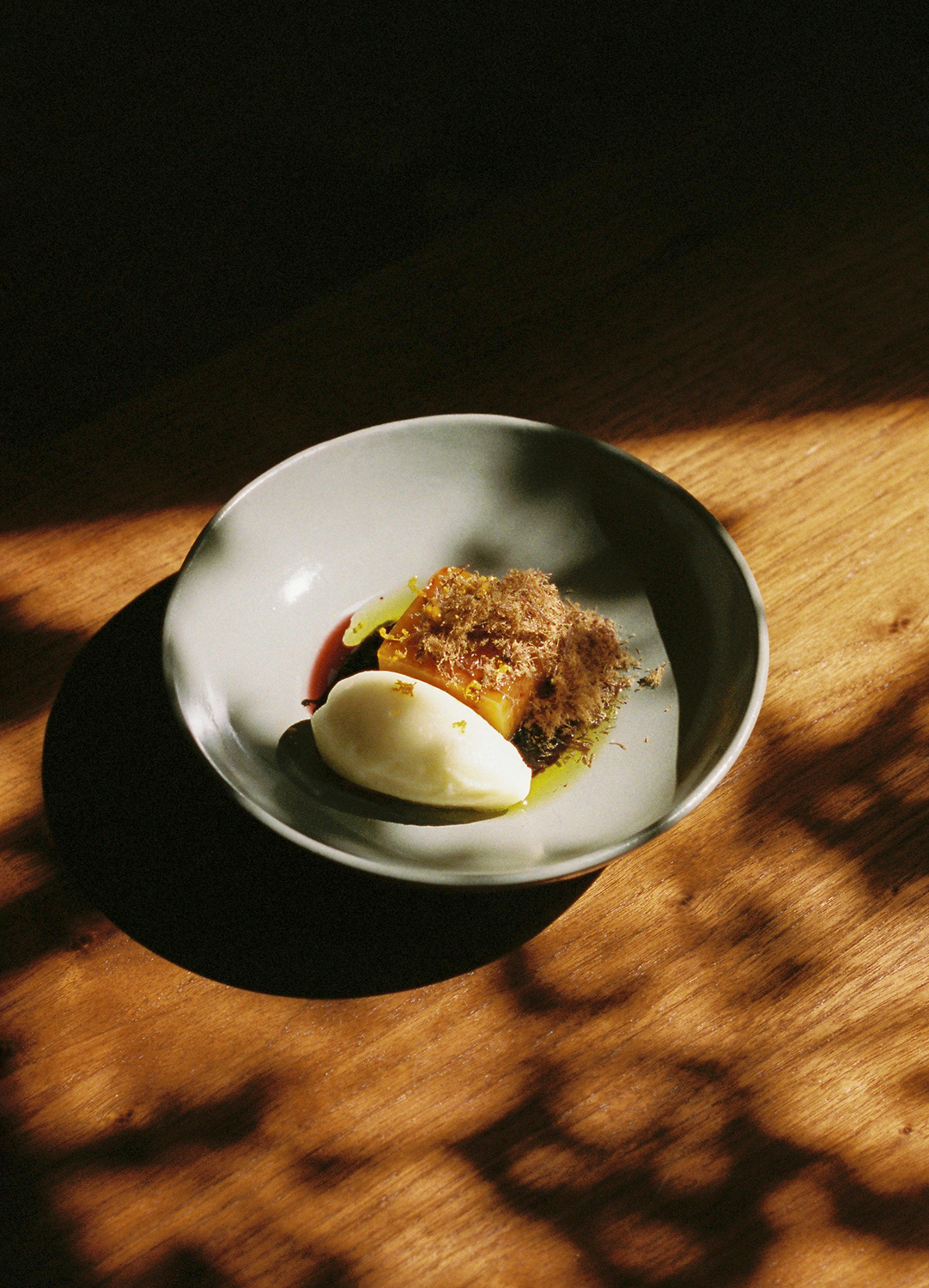
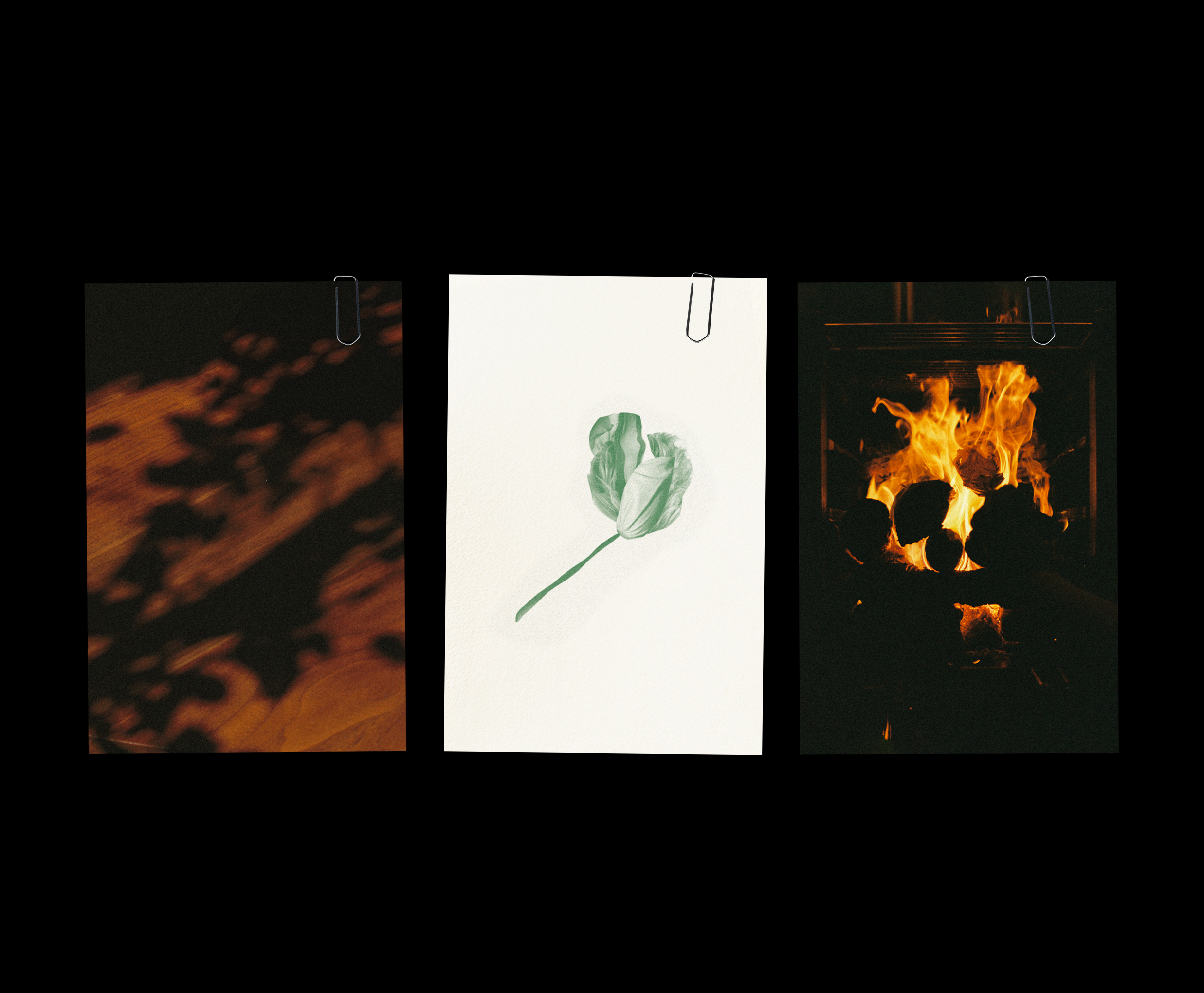
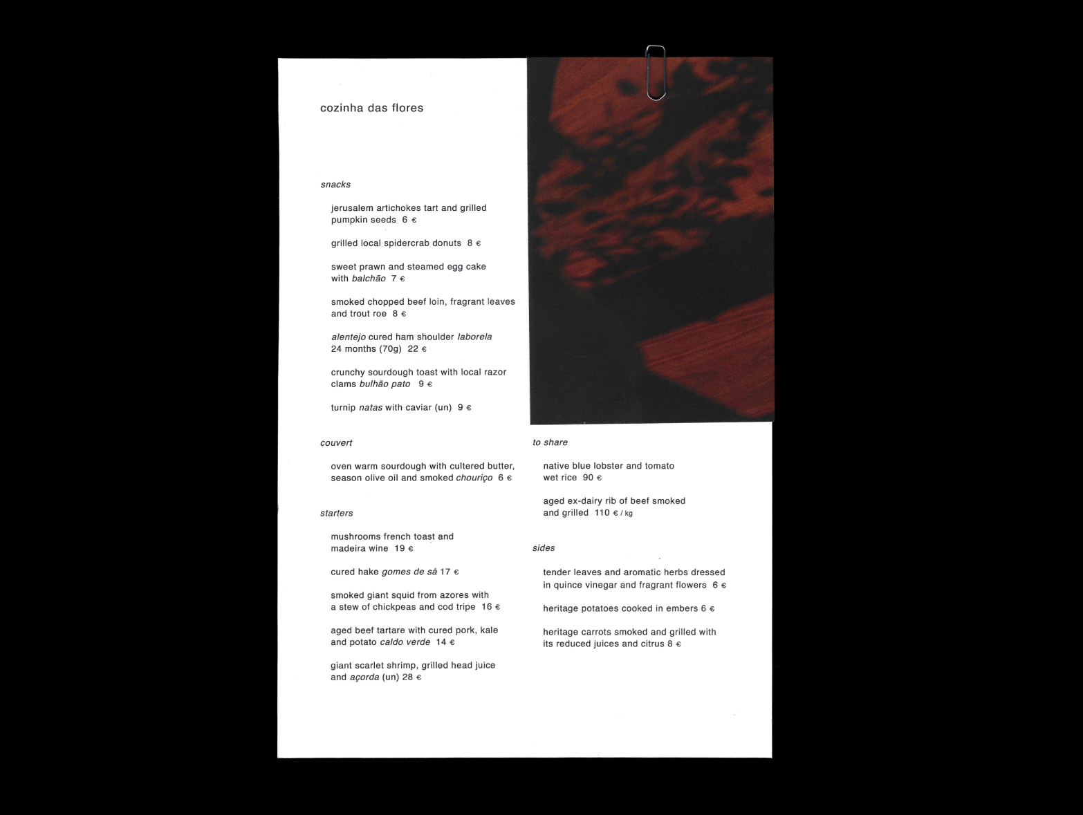
The warm light from the street streaming through the windows creates playful shadows on the wooden countertops, utilized as visual iconography to connect the restaurant and its food to the city outside.
Through the use of natural lighting and low camera angles, the food imagery is contextual and grounded, closely simulating the experience of a guest being presented with a dish at the restaurant.
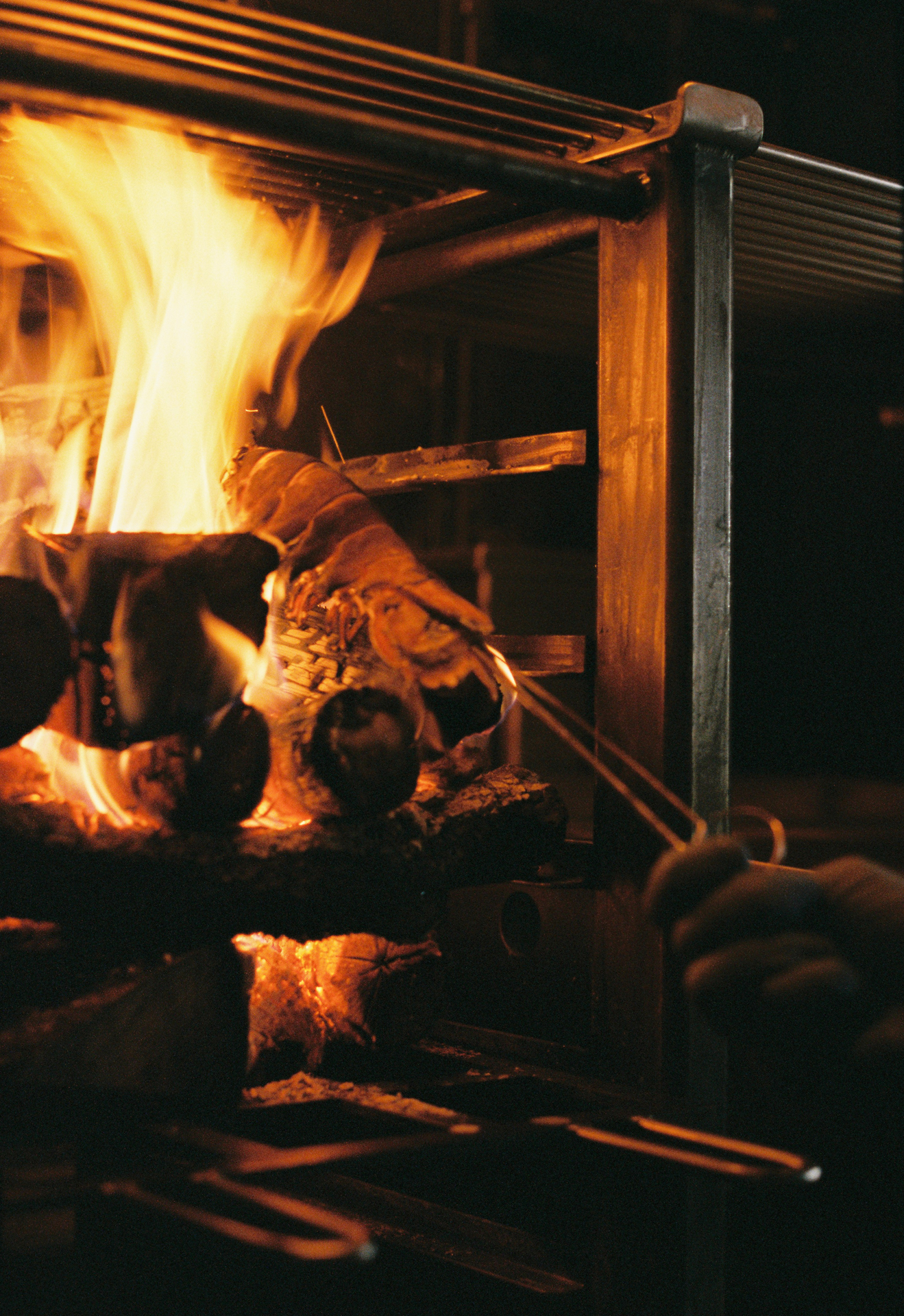
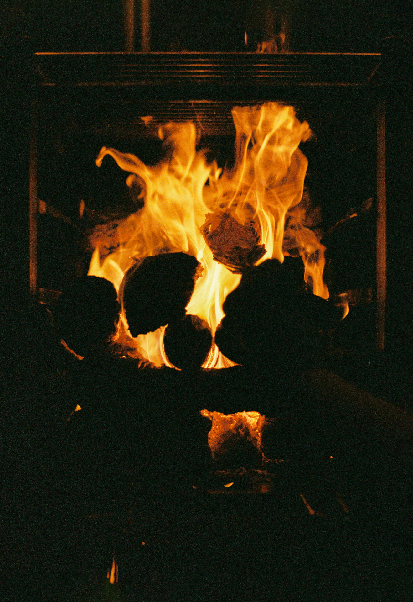
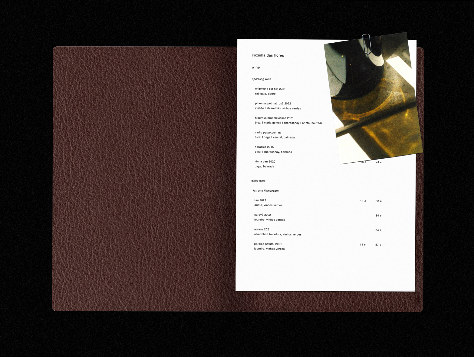
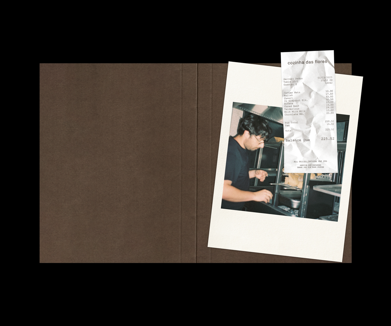
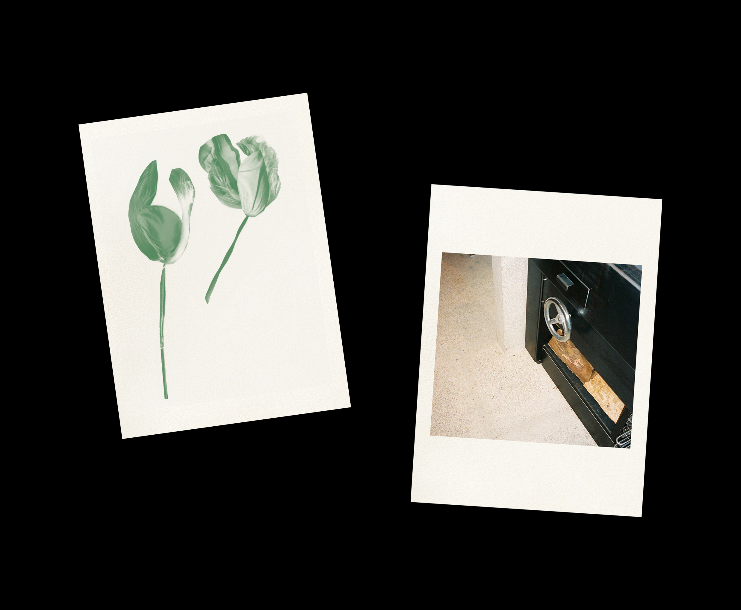
For the imagery to be used in the menus, the focus was on highlighting the periphery by presenting the materials and spacial elements that surround the main experience in the restaurant.
The art direction of collateral materials was made to fit with the brand identity created by Danish graphic design studio All the Way to Paris.
